How Artists Use Reference Collections to Develop Ideas
Artists’ reference collections help you compare sketches, clippings, and scraps, spot useful visual relationships, and turn them into a clear next step.
The common mistake with artists’ reference collections is treating every image as a self-contained answer. That can cost a project its most interesting discovery: a connection between fragments that were never made to belong together. A charcoal contour, a torn color patch, and a hinge diagram may suggest a form none of them shows alone.
A sketchbook can preserve an observation made in the moment, while a scrapbook can bring that observation into contact with borrowed, found, or reproduced images. The distinction is useful but not absolute. Both can become places where visual thought gathers.
Reference collections preserve more than what you saw
A drawing made from direct observation records a particular encounter: the angle of a bent branch, the shadow beneath a chair, or the folds at a wrist. A clipping preserves something different. It carries an image out of its original setting so you can consider it for another purpose.
Detached from a magazine page, a fragment can change jobs. A photograph of cracked pavement might suggest a painted texture. A botanical illustration might offer branching lines rather than a model of a plant. The source does not dictate the finished work; it gives you something specific to notice.
Brief labels help keep that attention clear. “Overlapping edges” names a visual feature. “Good composition” does not say what caught your eye. Note the quality you may want to carry forward.
Sketchbooks and scrapbooks support different kinds of thinking
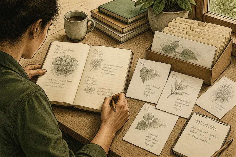
Sketchbooks often preserve the hand moving through a problem. They hold a quick contour, a change of mind, a diagram beside a sentence, or several attempts at the same shape. Their sequence can show how an observation was translated and altered.
Scrapbooks gather images and objects that already exist elsewhere. They can hold printed reproductions, packaging, maps, fabric swatches, notes, and personal ephemera. Separate sources can sit side by side, even if they came from unrelated places.
The boundary is porous. You might paste a paper fragment into a sketchbook, draw over a copied image, or add a handwritten note to a scrapbook page. Ask what kind of thinking the page should support: recording, comparing, revising, or a mix.
Choose a surface for the work you want it to do, not for how finished the collection should look.
Juxtaposition can reveal a useful visual relationship
Placing two images together changes how each one reads. A curved outline beside a photograph of a river bend may make both seem related to movement. A grid beside woven cloth may bring structure into view. The pairing can help even if the images have no common subject.
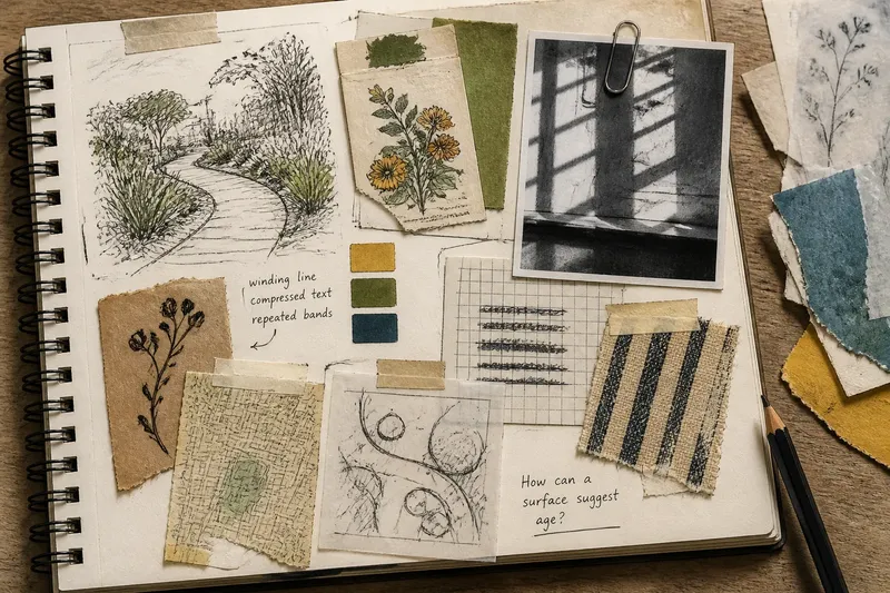
Say you are developing a poster about a neighborhood garden. You collect a hand-drawn path, a seed packet with dense lettering, and a photograph of a window’s striped shadow. Put them together and note the features: a winding line, compressed text, and repeated bands. The next action is to draw thumbnail compositions using those features, rather than copying any source. The observable result is a set of rough layouts you can compare for how the elements work together.
A connection is a working proposal, not a hidden message waiting to be decoded. Make a small drawing, move the fragments, or write one sentence describing the relationship. If it suggests a useful next move, keep exploring; if it feels forced, change the arrangement.
How do you choose and use reference material?
What belongs in an artist’s reference collection?
Keep material that gives you something particular to observe: an unusual edge, a color relationship, a repeated mark, or an arrangement of shapes. If you cannot name a feature that interests you, set the item aside rather than adding it automatically.
Should you copy a reference directly?
Copying can help you study a source, but it is only one response. You can isolate a feature, combine it with another source, change its scale, or use it to prompt a new drawing. Choose the action that serves the question you are working on.
How can you keep references from taking over a project?
Give the collection a question, such as “How can a surface suggest age?” Compare material against that question. If a visual decision emerges, make a study; if the material keeps producing more possibilities without helping you choose, pause collecting and test one idea.
When should you credit a source?
Keep source details for material you may publish, exhibit, or share, and distinguish your own marks from copied imagery. Rights and attribution depend on the source and intended use. Check creator information and applicable rules, and seek qualified guidance if the situation is unclear.
Page arrangements make comparison easier
A useful spread need not be decorative. It needs to let your eye move between elements. Try these arrangements and use what you observe to decide what to do next:
- Pair: If two fragments share a visible feature, such as a curved edge, place them together and sketch that feature; if you cannot name a connection, separate them and try another pairing.
- Sequence: If three images shift from loose to dense or pale to dark, arrange them in that order and draw the transition; if the order does not reveal a progression, rearrange them by a different visible quality.
- Center and orbit: If one drawing raises several related questions, place it in the middle and put supporting scraps around it; if the scraps distract from the drawing, remove the least relevant ones.
- Contrast: If a regular pattern beside an irregular one makes their differences easy to see, keep them together and note the tension; if the contrast adds no useful observation, replace one fragment.
- Overlay: If tracing paper lets you compare contours without obscuring either source, lay it over one image and draw the shared line; if the forms do not align meaningfully, lift the sheet and compare them side by side instead.
- Open space: If annotations and fragments feel crowded, leave a blank area for a quick study; if the empty space does not help you test an idea, use it for a source note or remove an unrelated scrap.
Use removable adhesive or loose paper while deciding. A movable fragment can be compared with several neighbors; a fixed one commits the page before the relationship is clear. Pencil arrows and brief annotations can show possible links without making the spread feel finished.
Keep sources visible as you transform them
It helps to tell what came from direct observation and what came from an existing image. A caption, source note, or clear margin preserves that distinction. It also helps you revisit a fragment without mistaking your interpretation for the source itself.
Then change the material deliberately. Crop a photocopy, redraw a contour, translate a color into pencil marks, or combine a texture with a different shape. Each action asks what matters in the source and what can be left behind. If a copied image has restrictions or unclear permissions, keep it to private study until you have checked what sharing is allowed.
Artists’ reference collections become useful when arrangement changes what you can see or make next. Name the feature that draws fragments together, then make a small study that tests the connection. That study can also reveal which source details need to stay visible as you develop the work.